The Correct Way to do Sentence Spacing
Back when I first redesigned this blog, I mentioned that I drew a lot of inspiration from the online ebook Practical Typography by Matthew Butterick. That book helped guide a huge amount of this website’s design, from the font choice, to the line length and spacing, and is arguably responsible for the reading experience you’re having right now. I still recommend it to this day, since following its guidance can help make any text you write readable and pleasant to look at.
Butterick is a very opinionated guy, and the book bears this out. One of the early chapters in his book is titled One Space Between Sentences, and it’s best summarized by quoting the first two sentences:
Some topics in this book will offer you choices. Not this one.
Always put exactly one space between sentences.
People who put two spaces between sentences tend to be a very vocal group, and Butterick isn’t shy about pushing back against them. He says it’s simply not part of today’s typographic practice, and thus shouldn’t be used. He calls it a typewriter habit, and that the only place it makes even a slight amount of sense in a typewriter-like monospaced font. If you’re a good typographer, he says, you use one space between sentences and that’s that.
I bought into this: I had already been in the habit of using just one space, and so it reinforced my already-existing beliefs. Somewhere in the last year or so, though, I came across a website that examined that claim in detail. Like I said, the people that care about two-spacing seem to care about it a lot, and this website—called Sentence Spacing, and run by Thomas A. Fine—has a whole host of articles dedicated to convincing you that you should put a wider space between sentences than between words. I was skeptical, but in the spirit of valuing criticism of my beliefs I decided to give it a read.
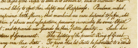
Butterick, in making his argument, generally appeals to authority and aesthetics: modern typographers don’t do wider sentence spacing, and it throws off the balance of whitespace within the page, often causing “rivers” of whitespace. Fine, on the other hand, does a deep dive into historical typographical practices, and he ends up with a pretty rich set of facts to back up his claims. He brings out examples of older documents and books to show how they used wider sentence spacing even though they weren’t typeset on a typewriter. He even points out the American Declaration of Independence was written with wider sentence spacing, and that predates the earliest typewriters by about a century!

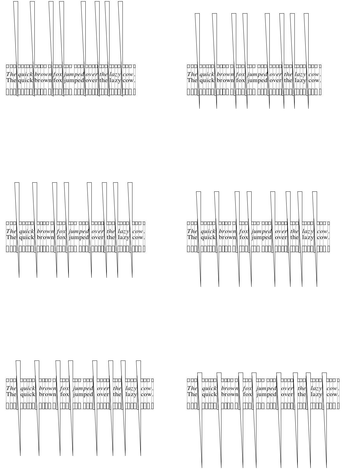
He actually traces the history of the one-spacing habit—and the decline of sentence spacing—claiming that it came into practice with the Linotype machines, a popular typesetting machine invented in the late 1880s. Linotype machines could automatically justify text on a page because they used triangular “spacebands” that could be slid in and out to adjust the spacing.1

However, with the Linotype, you couldn’t put two spacebands next to each other.2 If you wanted a wider space between sentences, you’d have to make sure to insert a blank matrix next to the spaceband at the end of each sentence. As new teletypesetter technology allowed typewriter-like keyboards to replace the big Linotype keyboards, combined with less-experienced operators running them, the practice of adding a blank matrix fell out of favour as the operators were told not to ever type the spacebar twice or risk damaging the machine.3
This actually makes some sense. It’s yet another example of a convention that came about due to now-defunct historical context. And honestly? Some of those older books he showed pictures of looked really nice.

I wasn’t completely convinced that it was strictly better, but I could appreciate the aesthetic appeal on these professionally-typeset documents. I noticed that the wider spacing allowed me to visually differentiate between sentences a lot better, making it easier to keep place in the text, and easier to jump my gaze between sentences. And I accepted that Butterick was wrong about his historical claims, at least.
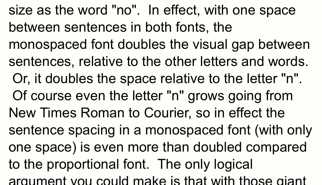
But there was one thing I couldn’t shake about that website. On desktop, its typography looks fine, and even has a nice little selector on the right-hand side for how wide you want your sentence spacing to be. This is because the author includes some programmatic trickery to replace the double-spaces with a dynamic-width HTML span element that can be any size you want.
On mobile, it looks like he doesn’t have that neat little feature, but it still uses two spaces to give wider sentence spacing. What does it look like there?

Oh. Oh no…
HTML is bad for typography
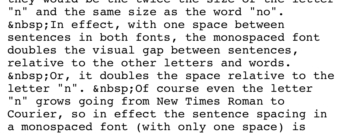
Yep, the website has weird, inconsistent spacing on the left margin when viewed on mobile. This is due to a workaround Fine implemented for an HTML quirk.
HTML compresses any string of spaces and newlines into a single space character. It’s why line breaks in HTML have to be written as <br> instead. So if you naïvely try to do double-space sentence spacing in HTML, the browser will work against you and erase all your hard work.
The solution Fine came up with is to replace the second space with a non-breaking space, represented in HTML as . HTML doesn’t compress non-breaking spaces, so this preserves the wider spacing.

This is unequivocally the wrong way to do this. Non-breaking spaces aren’t meant to be used like this. They’re for when you want to make sure that two words or symbols separated by a space stay on the same line, because it would be weird to have a line break in the middle of something like “45 kg”.
The desktop version of that site does it better, with its quirky programmatic spacing, but it’s also non-portable. It’ll work fine on that specific version of that specific website, but try and copy-paste any part of that site to another document and you’ll end up pasting only a single, narrow space. You can’t use that technique anywhere other than a browser.
So what’s a better solution?
Use the right character for the job
Butterick makes a point of always pushing for people to use the proper, correct character wherever possible. He tells you to use curly quotes instead of straight quotes, use ™ and © for trademark and copyright instead of (TM) and (c), and use proper ellipsis characters instead of just stringing together three periods.
We can take that principle and apply it here too. Instead of using two space characters and doing torturous things to make HTML do what we want, we should just use a wider space character.
Unicode has a few options out there for us. Below, you can see three space characters I picked out surrounded by arrows for visibility:
- → ←: A regular space character (U+0020)
- → ←: An “en space” character (U+2002)
- → ←: An “em space” character (U+2003)
The en space seems like a pretty good character for the job. At least in this font, it’s about twice the size of the regular space, so it emulates the “double-space” look pretty well.
Some of the historical documents on the Sentence Spacing site have even bigger spaces, but I found that the em space tends to make left-aligned text look really disjointed, so I’d really only recommend doing that if you’re planning on justifying the text (and turning on auto-hyphenation).4 See below for an interactive demo of what each of these look like.
How do I insert these characters?
“Okay,” you might say. “I can just copy-paste the en space and replace every dot-space in my document with dot-en-space. Right?” Well, no. There are a lot of places where periods followed by a space show up in English other than the end of a sentence. If you try to do that, you’ll end up with extra spacing where it shouldn’t be, e.g. after acronyms, or in names such as T. A. Fine. (For comparison, this is what e.g. would look like, and this is what T. A. Fine would look like, if you inadvertently used en spaces.)5
So if we want to use sentence spacing, how do we use the wider space characters? You can’t type them directly. But what you can do is type the double-space after each sentence, and then find-and-replace the double spaces to en spaces (or em spaces) after you’re done writing.
In fact, depending on your publication method, you can even automate this. That’s what I did for this post. This whole article was written with two spaces after each sentence, and I wrote a small Jekyll plugin that automatically replaces all double-spaces-after-punctuation with an en space. Dropping this into the _plugins directory of any Jekyll site will cause it to add proper en spaces to any post that has sentence_spacing: true in its YAML front-matter. You can also add that to your default post settings if you want it to apply to all posts.
Is it worth it?
The other option is you could just… not. Butterick is arguably right: regardless of historical practices, these days people more frequently use a simple word space after each sentence. It may have been Linotype that ended this centuries-long practice, but people are used to it by now and the differences in usability and reading speed seem minimal at best.
Ultimately, I think it’s a matter of personal preference. I don’t think I’m going to adopt sentence-spacing for this blog beyond this article, since it’s a bit too much of a hassle to make it work. Sentence spacing also tends to look better on justified text, but justified text needs to be hyphenated in order to look any good, and browsers’ support for auto-hyphenation is a bit spotty. And honestly? I’m just used to only hitting the space bar once.
But if you’re really going to be one of the die-hard sentence-spacers, it’s best to do it right.
Demo
In this demo, you can play around with different forms of sentence spacing to see what you like best.Click the options below to see what these paragraphs would look like with either regular spaces between sentences, en spaces, or em spaces.You can also see what they would look like with justification and hyphenation (if your browser supports automatic hyphenation).The text in the paragraph below is a sample taken from Mark Twain's The Innocents Abroad, the same book as one of the above images.
I think it was the blankest-looking party I ever saw.It was as if every soul had been stricken dumb.Wine-glasses descended slowly to the table, their contents untasted.Cigars dropped unnoticed from nerveless fingers.Each man sought his neighbor's eye, but found in it no ray of hope, no encouragement.At last the fearful silence was broken.The shadow of a desperate resolve settled upon Blucher's countenance like a cloud…
Sentence spacing:
-
He also blames this autojustification feature for the idea that sentence spacing causes rivers of whitespace in Linotype-typeset documents, because although Linotype was able to adjust the spacing between words, it couldn’t automatically adjust the spacing between letters within a word. ↩︎
-
Or rather, you could, but it could cause damage to the spacebars or cause some hot metal to squirt out during the casting process. ↩︎
-
Fine seems to imply that it may even have been impossible to insert a separate space matrix on a teletypesetter, since the keyboard presumably only had one key to insert a space. ↩︎
-
When using justified text, there is one downside to this technique that I discovered while writing this article: if an en or em space falls at the end of a line of text, browsers align the right edge of the space to the right margin, instead of the right edge of the word, leading to uneven right margins. You might be able to notice this in the demo, depending on your screen size. It’s unfortunate and I don’t know of a way around it. I’d argue that this is a bug in the browsers, and it’s present on every major browser I tested. ↩︎
-
This is, incidentally, the reason Fine gives explaining why you can’t just build this kind of spacing into a font: fonts don’t know where sentences end, only you do. ↩︎