Lucky Shot Postmortem
A while ago, I released my retro-gambling-shooter game, Lucky Shot, to the public. As I mentioned there, this wasn’t the first time the game had seen the light of day — it was created for the University of Toronto Game Design and Development Club’s 2011 Game Making Deathmatch. It won the grand prize in the judged competition, ranked fourth in the public showcase, and was generally well-received. And of course, more than anything else, it was a great learning experience.
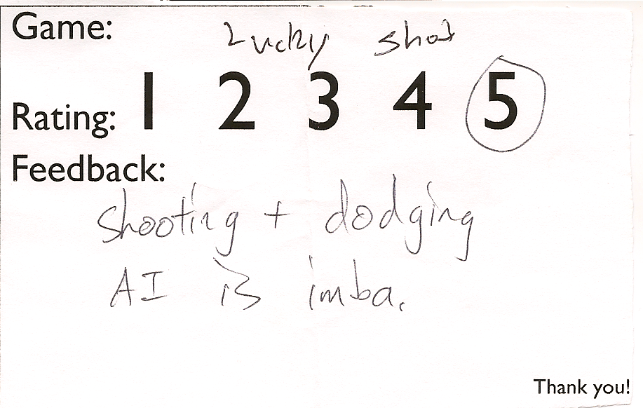
Last year was actually the first time the club ran the public showcase. We held it during the Computer Science Student Union’s game night, and to take full advantage of it, we gave out feedback forms, asking people to rate each game and write a few words about it. I found that the reactions we observed and the feedback we got were even more valuable than the prizes given out. With that in mind, let’s take a look at how people enjoyed the game.
You can tell who the Starcraft players were.
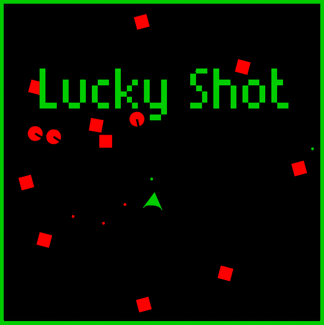
But before we get started, if you haven’t played the game yet, go do that now! This article will make a lot more sense if you’ve played it.
 </a>
</a>
Back? Ok, let’s get down to business.
What worked
Slim, bottom-up game design
This game was based on a very simple idea: a top-down shooter where you gamble for your guns. The gambling element came from the theme for the competition: Don’t be funky, let’s get lucky. But in development, instead of starting off with art, or music, or the gambling element, I started off with the very basics — movement, control, shooting, etc. Nothing extraneous was added until closer to the end. I built up a quick, simple, but very good and flexible framework for the game itself in the earlier stages of the competition, and later on I took as much time as I could to polish it, give it a good interface, and cram in as much content as possible (which in my case meant coding up a big variety of guns).
This can be risky for some people, as you can end up getting trapped in refining the framework and run out of time to build an actual game around it. But if you manage it right, and put priority on the actual game parts of your game, you end up with something playable very quickly. This is especially good for GMD, because of the need to balance the competition with school work. It’s likely that you’ll end up slammed with assignments or tests near the end of the competition, forcing you to hand in what you have done. If you have a playable game from the early stages, you at least have a chance at doing decently despite it being unfinished.
Arcade-style gameplay
This kept the game simple, accessible, and above all else, fun. It would have been nearly impossible to implement a game of calibre similar to an RPG, for example — it just requires far too much content to make it enjoyable. Arcade games can be enjoyable even if they’re only one level. And in the end, the environment in which they were shown lent itself far better to arcade-style pick-up-and-play gameplay than anything more complex.
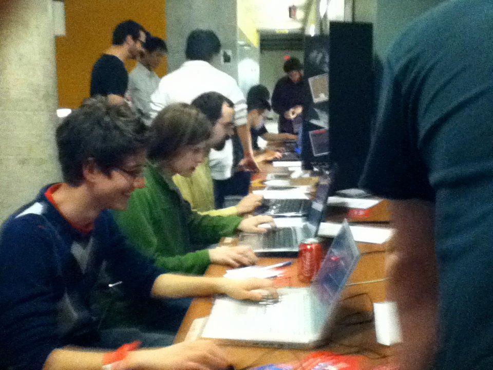
Grabbing people’s attention in between games of Counter-Strike.
Slick, simple AI system
This was one of the most complimented parts of the game, and it amazes me, because it was surprisingly simple to make. I won’t go into detail on this just yet, but keep your eye on this site, as I’ll be posting up some articles detailing the AI and physics systems soon.
Smooth difficulty curve with a high peak
The idea to make the later levels insanely difficult was inspired by the game Darkest Before the Dawn, made by my friends Francesco Ciarlandini and Sean Lacy for the previous year’s GMD. In their game, while it starts off relatively slowly, as it goes on it gets more and more difficult until all hell breaks loose near the end. Few people still have beaten that game. What I found, though, was that I kept coming back to it, playing it again and again, until eventually I managed to beat it. Its difficulty made it entertaining despite being relatively slim on content (as all GMD games are). Not only that, but the fact that the game treated me as if I wasn’t entitled to beat it made me even more determined to win. So I modelled Lucky Shot’s difficulty curve in a similar way. Most people should be able to get past the first few levels. Few will get past the last couple. And as of yet, I am the only one who has managed to beat the final level (and even I have only ever done it twice).
(As a side note, if you can provide evidence that you’ve beaten this game to me, I’ll personally acknowledge you on this blog as the first person to beat Lucky Shot other than its creator. Protip: save your Machine Guns for the last two levels.)
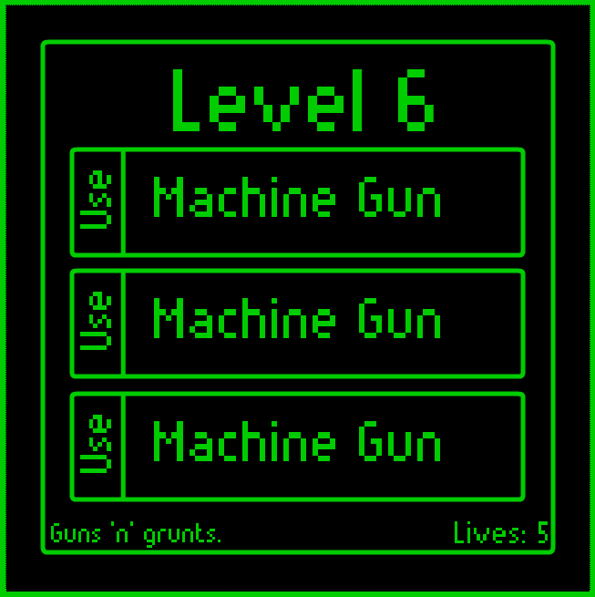
Doing it right.
What was interesting to me was comparing it against Francesco and Sean’s game from this year, Gamblon 777. This game was quite fun, managing to just barely beat me out for third place in the public showcase. But it didn’t have the smooth difficulty curve of the previous game. I noticed that many people would sit down at this game to play it, die within ten seconds, and simply get up and leave. It shows that you need that slow start in order to get people hooked in the first place.
Gradual introduction of concepts
Tying in somewhat to the above, it’s not just the difficulty curve that’s gradual — it’s the complexity as well. I had three types of enemies. Each behaved differently from the last, and they had a pretty obvious hierarchy in terms of difficulty. I had to make sure the player wasn’t confused by them at the beginning.
What I chose to do was introduce every enemy in turn, each in their own levels. Level 1 introduces you to the basic Drifter enemy that chases you. Level 2 is a slightly harder Drifter level. Level 3 introduces you to the Dodger. Level 4 is a slightly harder Dodger level, with a few Drifters thrown in at one point as a surprise. Level 5 introduces you to the Shooters. And so on. It’s not until the last few levels that they start mixing together in any significant way, and that’s when the game gets very difficult.
This is the same idea used by games like Portal. You have to deliberately train your players to understand and deal with your gameplay concepts before throwing them into situations where they have to manage several of them at once.
Minimalist art style
I’ll make no bones about it: I am not a good visual artist. This minimalist art style is my way of making something decently visually appealing, functional, and quick to make. And it allowed me more time to work on the game’s foundation.
Creative commons resources
Although I would have loved to have composed and created the music for the game myself, I spent nearly all of my time on the gameplay, making that impossible. I later found myself with an uncomfortably close deadline and no music. I knew I wanted an 8-bit style action-style song to compliment the retro visuals, so I popped open 8bitcollective (where all the songs are licensed under CC BY-NC-SA), found a song I liked, and threw it in there. And it immediately made the game much more fun. I’ve always been amazed at how much influence great music can have on a game.
Not to mention that it’s just so much better than anything I could have come up with myself. Exilefaker, you are a goddamn genius.
What could have been done better
Clearer instructions and between-level interface
This was one thing that surprised me. Several of the feedback forms mentioned a need for “more instructions”. Initially, I was confused. How hard is it to understand a game where you shoot red things? But then I realized that one of the most complex parts of the game — the between-level gun selection screen — had only minimal instructions on how to use it.
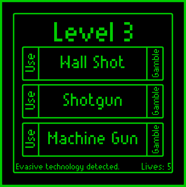
Whoops.
Not only that, but people seemed to completely miss things that I had included to make their lives easier. Things like the hints on the bottom-left as to which enemies are coming next, the lives indicator, or even the fact that you could hold down the mouse button to shoot.
To fix this, I could have added, on the first between-level screen, some helpful tips about the interface elements of the screen. A simple bit of text with some arrows pointing to the Gamble and Use buttons, describing each, would go a long way to helping people understand it. Highlighting the hint text and lives count in red would help to make them more apparent. And I guess the people took the words “Click to shoot” from the help screen a bit too literally, so it would have been nice to have made that clearer.
Originality, or lack thereof
I’ll be blunt here — this game was heavily inspired by games like Geometry Wars, even down to the enemy types and movements. As such, it doesn’t really stand out as something new or different, and this is a barrier to grabbing people’s interest. I expect it would be more interesting if I had had the time to add more gun types — after all, you’ve never seen Geometry Wars with mines, homing shots, or a nuke before, have you? Which brings me to my next point…
More content
Which in my case would mostly mean more gun types, though it could mean more enemies and levels as well. When I started conceptualizing this game, I had about a page and a half full of ideas for different gun types. The problem is that I ran out of time to implement them. I feel if I had managed my time better I could have done so.
Getting into a bit more detail, the limiting factor here was not actually the gun types themselves — it was the different types of bullets that I would have had to implement. By the end of the project I had exactly one type of bullet — the standard, round, travel-in-a-straight-line type. It was very easy to create new guns that would fire them in different directions, each with a different speed, range, and damage. It would not have been easy to create guns with bullets that curve, orbit, explode, split, penetrate, swarm, or home in on enemies. Some of those would require a new movement system. Some would require a different collision detection system. Some would even need AI. It just wasn’t feasible to add them given the time frame I found myself in near the end.
But it would have been so damn awesome.
The final word
Although there is definite room for improvement, I doubt I’ll revisit this game anytime soon, with the possible exception of some minor retrofitting to work with the upcoming UTGDDC arcade cabinet. The game is already good as it is now, and I’ve been spending my time recently on other projects. Still, this was a great experience. It was the first time since I got into game development in which I felt I had made something I could be proud of.
But in the end, it’s not my game anymore. It’s yours now. So play it, tell your friends, send me feedback, and most of all, have fun with it.